How to Choose White Paint: Undertones, LRV and Light
White is the colour people expect to be easy and then repaint twice. The trick is to understand undertone, reflectance and the light in your room before you open a tin.
There are hundreds of white paints on the market, and on a paint chart most of them look identical. On a wall they do not. One turns faintly grey on a winter afternoon, another looks almost cream next to a white sofa, a third glows slightly blue under daylight bulbs. None of these are faulty paints. They are whites with different undertones and reflectance, reacting to different light. Once you understand those two properties, choosing white stops being guesswork.
This guide explains what makes one white different from another, how room orientation and artificial light change it, how to test properly, and how to coordinate walls, ceilings and woodwork.
Why no white is simply "white"
Paint whites are made from a white base, usually titanium dioxide, with tiny amounts of tinting pigment. Even a drop of yellow oxide, red, black, blue or green shifts the white in a direction you might not notice on a small card but will see clearly on four walls. That hidden tint is the undertone.
Colour on a wall also intensifies. Each wall reflects light onto the walls beside it, so the undertone bounces around the room and builds up, especially in corners. That is why a white that looks neutral on a 5 cm (2 in) chip can look distinctly creamy or grey across a whole room.
Understanding undertones
Most whites fall into three broad families. Learning to recognise them is the most useful skill in choosing one.
| Family | Typical undertone | How it reads | Works well with | Watch out for |
|---|---|---|---|---|
| Warm whites | Yellow, red, pink or beige | Soft, creamy, welcoming | Oak, walnut, brass, terracotta, linen, cooler north light | Can look yellow or dated next to bright white fittings or in very sunny rooms |
| Cool whites | Blue, green or grey | Crisp, fresh, architectural | Chrome, marble, black accents, concrete, strong warm daylight | Can turn grey or cold in dim or north-facing rooms |
| Neutral / balanced whites | Very little tint, or a mix that cancels out | Clean without obvious warmth or chill | Mixed materials, galleries, rooms used at all hours | Can feel flat if the room lacks texture |
How to see an undertone
Undertones are easiest to judge by comparison. Hold your candidate whites against a sheet of plain printer paper, which is a bright, slightly blue-white, and against each other. Next to the paper, a warm white will look yellowish or pinkish and a grey-based white will look dirty or greenish. You can also compare against a large colour you know, such as the white of a bath or kitchen worktop, because those fixed whites will sit next to your paint every day.
Light reflectance value (LRV)
LRV measures how much visible light a colour reflects, on a scale from 0 (absolute black) to 100 (a theoretical perfect white). Most manufacturers print it on the colour card or in the product details. Whites typically sit between about 75 and 94.
- LRV 88 and above: very bright whites. They maximise light in dim rooms but can glare in sunny spaces and look stark on large wall areas.
- LRV 80–88: soft whites and off-whites. A comfortable range for most living spaces; still very light, but gentler on the eye.
- LRV 70–80: very pale neutrals that read as white in bright rooms and as light stone or putty in dim ones.
A common assumption is that the brightest white will make a dark room feel bright. In practice, a high-LRV white in a room with little daylight often looks grey, because there is not enough light for it to reflect. A slightly warmer white with an LRV in the low to mid 80s frequently looks lighter and more pleasant in the same room. LRV tells you about reflectance; it does not tell you how a colour will feel.
How the direction of light changes white
The descriptions below apply to the northern hemisphere. In the southern hemisphere, swap north and south.
- North-facing rooms receive indirect light from the sky, which is cool and consistent throughout the day. Cool whites can look grey and flat; warm or soft whites usually feel more comfortable.
- South-facing rooms get strong, warm light for much of the day. Almost any white looks good, but very warm whites can become yellow, and very bright whites can glare. A neutral or slightly cool white often balances the warmth.
- East-facing rooms are bright and warm in the morning and cooler and bluer from midday. Choose for the time of day you use the room most.
- West-facing rooms are cooler in the morning and glow orange in the evening. Whites with a balanced or slightly cool base stop sunsets turning the walls peach.
Outside matters too. A tree outside the window casts green light onto the walls; a red-brick building opposite reflects warmth. Large windows facing a wide sky behave differently from a small window onto a narrow side return.
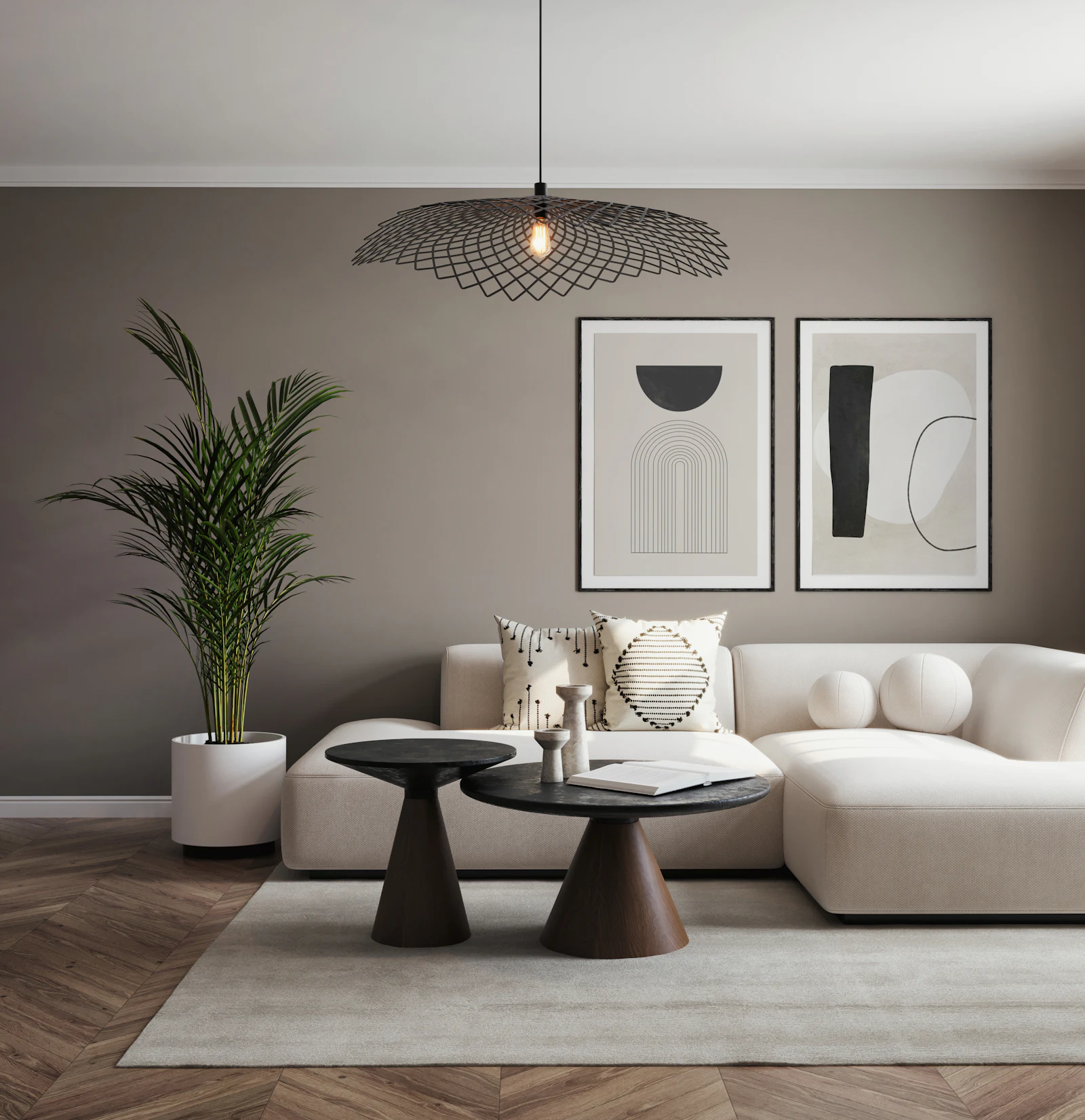
Artificial light
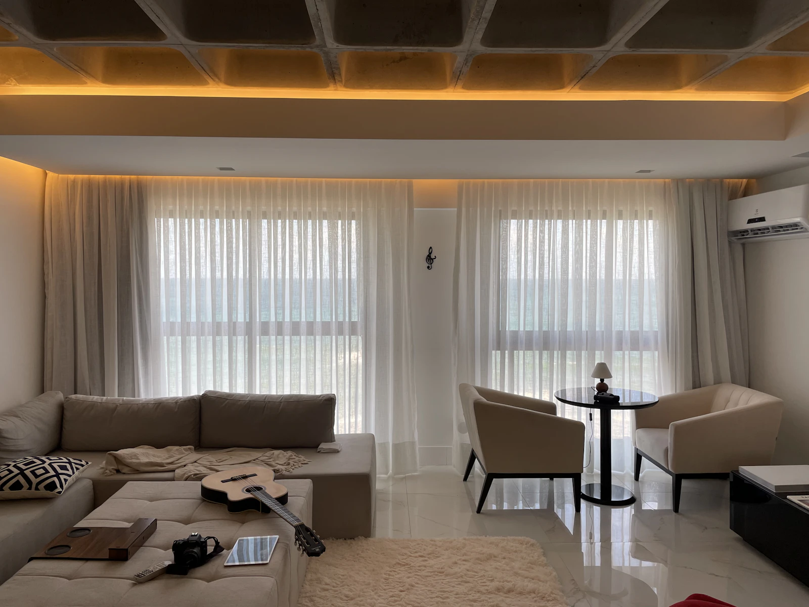
Evening light changes everything. Warm bulbs at 2700 K make every white look creamier; cooler 4000 K bulbs make whites look crisper and can make grey-based whites look clinical. Many homes mix both, which is one reason a white can look inconsistent from room to room. Decide on bulb colour temperature before finalising paint, and test your swatches at night under the bulbs you will actually use.
How to test white paint properly
Small chips and tiny brush-outs are the main reason people end up repainting. A reliable test takes a few days but saves several litres of paint and a weekend of work.
- Shortlist three or four whites based on undertone and LRV, not on name or popularity.
- Make large swatches. Paint pieces of white card or lining paper at least A3, ideally 60 × 60 cm (24 × 24 in). Apply two coats so the colour is true, and leave a white border so you are not comparing them to the old wall colour.
- Use the real product. Sample in the finish you intend to use, because sheen changes how a white reads (see paint finishes explained).
- Place swatches where it matters. Put one on the darkest wall, one next to the window, one near the floor and one next to fixed items such as a kitchen worktop, tiles or the sofa.
- Look at them at different times: morning, midday, late afternoon and evening under artificial light, over at least two days, ideally including a cloudy one.
- Eliminate rather than choose. Remove the white that looks wrong most often. Repeat until one remains.
Avoid painting test patches straight onto an existing coloured wall. The old colour around the patch distorts your perception, and thick patches can show through the final coat as slightly raised areas.
Walls, ceilings and woodwork
Ceilings
Ceilings receive less direct light than walls, so the same white usually looks a shade darker overhead. There are three sensible approaches:
- Same white as the walls for a seamless, enveloping room. This works particularly well in rooms with low ceilings or awkward angles, as there is no line to draw the eye.
- Wall colour at reduced strength (often 25–50%, which many paint mixing services can do) to keep the undertone consistent while making the ceiling feel lighter.
- Brilliant white ceilings in modern spaces with cool or neutral whites. Next to warm off-white walls this can make the walls look dirty or yellow, so check the pairing on swatches first.
Doors, skirting and trim
The simplest, most cohesive option is the same white as the walls in a tougher, slightly higher sheen, such as eggshell or satin. The difference in reflection gives just enough definition. If you prefer contrast, use a crisper white on woodwork, but keep the undertones related: a cool trim against warm walls can look accidental. In period homes with deep mouldings, a slightly darker, warmer woodwork colour can emphasise the detail.
Whites across the whole home
You do not need one white throughout, but connected spaces read better when whites share an undertone. A practical approach is to choose one main white for hallways and open-plan areas, then allow neighbouring rooms to step warmer or cooler depending on their light. For wider colour planning, see our guide to choosing a colour palette for your home.
Matching white to materials
White walls are rarely seen in isolation. They sit next to floors, furniture and fixed finishes that already have strong undertones.
- Warm wood floors (oak, walnut, cherry): warm or balanced whites keep the room harmonious; cool whites can make the wood look orange.
- Grey or concrete floors, marble and chrome: neutral or cool whites usually suit best.
- Brass, terracotta, rattan and linen: softer, creamier whites flatter natural colours.
- White kitchens and bathrooms: compare paint directly against the units, tiles and sanitaryware. A wall white that is much warmer than a bath, for example, will make the bath look blue.
Whites for particular situations
Open-plan spaces
In a large space that combines kitchen, dining and living areas, light changes dramatically from one end to the other. Choose one white for the whole envelope so the space reads as a single room, and test it at the darkest and brightest points before committing. A balanced or slightly warm white is usually the safest choice because it copes with both conditions.
Small, dark rooms
Cloakrooms, box rooms and internal hallways often have little or no daylight. Very bright whites tend to look grey here. A soft white with a gentle warm undertone, or even a pale stone or putty colour, usually looks lighter in practice. Alternatively, embrace the darkness with a deeper colour and use white only on the ceiling.
Period homes
Older houses with cornicing, panelling and deep skirting often suit softer, chalkier whites, which flatter imperfect plaster and handmade details. Crisp brilliant whites can look harsh against old timber and tiles.
Rooms with strong accent colours
If you are pairing white walls with a bold sofa, rug or artwork, pick a white whose undertone leans towards the accent. A slightly warm white sits comfortably with terracotta, ochre and rust; a cooler white suits navy, emerald and black. This makes the white look intentional rather than leftover.
Common mistakes
- Choosing from a small chip. Undertones only appear at scale. Always test with large swatches.
- Assuming the brightest white is the lightest-looking. In dim rooms, very bright whites often look grey.
- Testing only in daylight. Many rooms are used mostly in the evening. Check swatches under your bulbs.
- Ignoring fixed whites. Sanitaryware, worktops, window frames and sockets will sit next to your walls for years.
- Pairing clashing whites. A cool brilliant white ceiling over a warm cream wall can make both look wrong.
- Copying a white from a photograph. Photos are edited, lit and colour-corrected; the room they show does not face the same way as yours.
- Mixing bulb colour temperatures in one space, so the same wall looks two different whites at night.
Summary checklist
- Which way does the room face, and when is it used most?
- What undertones do the floor, furniture and fixed finishes have?
- Have you shortlisted whites by undertone and LRV rather than name?
- Have you painted large, two-coat swatches with the real product and finish?
- Have you viewed them in morning, afternoon and evening light, under your own bulbs?
- Have you decided how ceilings and woodwork will relate to the walls?
- Have you calculated quantities? The paint calculator helps you avoid buying too much or running short mid-wall.
A well-chosen white is barely noticed: the room simply looks bright, calm and right at every time of day. That quiet result is worth a few days of testing.
Frequently asked questions
What is the best white paint for a north-facing room?
In north-facing rooms in the northern hemisphere, daylight is cool and indirect, so whites with a slightly warm undertone (a touch of yellow, red or soft grey-beige) usually look more comfortable. Very pure or blue-based whites can read as grey and chilly. Always test, because the size of the window and what is outside it also matter.
What does LRV mean on a paint chart?
LRV stands for light reflectance value: the percentage of visible light a colour reflects, on a scale from 0 (black) to 100 (a perfect white). Most whites sit between about 75 and 94. A higher LRV feels brighter but can glare in sunny rooms, while a slightly lower one feels softer.
Should the ceiling be the same white as the walls?
It can be. Using the wall white on the ceiling gives a seamless, calm look. A brilliant white ceiling can make an off-white wall look dingy by contrast, so if you use a different white, choose one with a compatible undertone or a version of the wall colour mixed at reduced strength.
Why does my white paint look different from the sample card?
Small printed chips are too small to show undertone, and they are often viewed under shop lighting. On a full wall, colour reflects onto itself and onto adjacent walls, so it intensifies, and your daylight and bulbs shift it further. Paint large swatches with real paint in the room instead.
Is brilliant white a good choice for walls?
Brilliant white works well in modern spaces with lots of daylight and crisp detailing, and on ceilings. In rooms with little sun, or next to warm materials such as oak and terracotta, it can look stark or bluish. A soft off-white is often more forgiving for everyday living spaces.
Measurements and rules of thumb in this guide are starting points; always check your own room, local building rules and manufacturer instructions. Images are illustrative, from Unsplash. Read how we research and update our guides in our Editorial Policy, and tell us if you spot an error.