How to Choose the Perfect Color Palette for Your Home
The right colour palette makes a home feel cohesive, calm and personal. This step-by-step guide explains how to understand undertones and light, build a balanced scheme and carry it confidently from room to room.
Colour shapes how a home feels more than almost any other design decision. The right palette can make a small room feel open, a large room feel intimate and a busy household feel calm. Yet choosing colours is also one of the decisions people find hardest. With thousands of paint shades available, and colours that seem to change from morning to evening, it is easy to feel overwhelmed.
The solution is to stop thinking about individual colours and start thinking about a palette: a small, considered group of colours that work together across your whole home. This guide walks you through a clear, step-by-step method, from understanding light and undertones to testing samples and applying the palette room by room.
Why a whole-home palette matters
When each room is decorated separately, a home can feel disjointed, especially in open-plan layouts or when rooms are visible from a hallway. A palette creates flow. It gives your home a recognisable identity and makes decisions easier, because every new paint, fabric or piece of furniture can be checked against the same set of colours.
A palette does not mean every room looks the same. Instead, rooms share a common language. One room may use the palette’s green as the dominant colour; another may use it only as an accent. The result is variety with coherence.
Step 1: Start with what you cannot change
Before you open a paint chart, look at the elements of your home that are fixed or expensive to replace:
- flooring, such as oak boards, terracotta tiles or grey carpet;
- kitchen cabinets and countertops;
- bathroom tiles and fixtures;
- fireplaces, exposed brick, stone or beams;
- large furniture you intend to keep, such as a sofa or dining table.
These elements have their own colours and undertones. Your palette must work with them. A pink-toned beige floor, for example, will clash with a cool blue-grey wall, while a warm ivory will harmonise with it.
Step 2: Understand light and orientation
Light changes everything. The same paint can look completely different in two rooms of the same house. Observe each room at different times of day before choosing colours.
Natural light
In the northern hemisphere, north-facing rooms receive cooler, indirect light that can make colours appear greyer and darker. Warm neutrals and colours with yellow or red undertones help balance this. South-facing rooms enjoy warm light for most of the day, so they can take cooler colours and will make warm colours glow. East-facing rooms are bright and warm in the morning and cooler later; west-facing rooms are the opposite. In the southern hemisphere, the north and south effects are reversed.
Artificial light
Bulbs also influence colour. Warm white bulbs, around 2700 kelvin, bring out yellows and reds, while cooler bulbs emphasise blues and greys. Test colours under the lighting you will actually use in the evening.
Step 3: Learn to read undertones
Undertones are the subtle hues beneath a colour. They are the reason two “beige” paints can look entirely different. Understanding undertones is the key to building a palette that feels harmonious.
Warm vs. cool
Warm neutrals lean towards yellow, red, orange or pink. They feel inviting and cosy. Cool neutrals lean towards blue, green or violet. They feel crisp and fresh. Neither is better; what matters is that the colours in your palette relate to each other and to your fixed elements.
How to spot undertones
- Place samples next to a sheet of pure white paper; the undertone becomes more visible.
- Compare several similar colours side by side. Differences that are invisible alone become obvious together.
- Look at the darkest shade on the same paint strip; it often reveals the hidden hue.
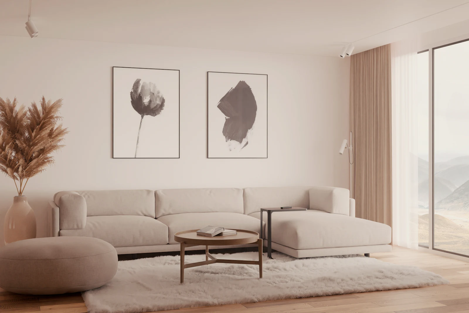
Step 4: Build your palette
A practical home palette usually contains three to five colours. Think of them in roles rather than as a list of favourites.
The base neutral
This is the colour you will use most, often on walls in hallways, living spaces and ceilings. Choose a warm or cool neutral that works with your fixed elements and your light. Ivory, soft white, stone or greige are reliable options.
The secondary colours
One or two supporting colours add depth. They might be a deeper version of your neutral, such as sand or taupe, and a colour with more character, such as sage, olive, dusty blue or clay. Use them on feature walls, in bedrooms, on joinery or in large textiles.
The accent
The accent is the colour that brings energy: rust, deep green, ochre, navy or a warm brown. Use it sparingly in cushions, art, a chair or a painted door.
An example palette
Our own brand palette is a good illustration of how these roles work together:
| Role | Colour | Where to use it |
|---|---|---|
| Base | Ivory (#F4F0E9) | Walls, ceilings, large surfaces |
| Secondary | Sand (#B9AB93) | Textiles, rugs, upholstery, joinery |
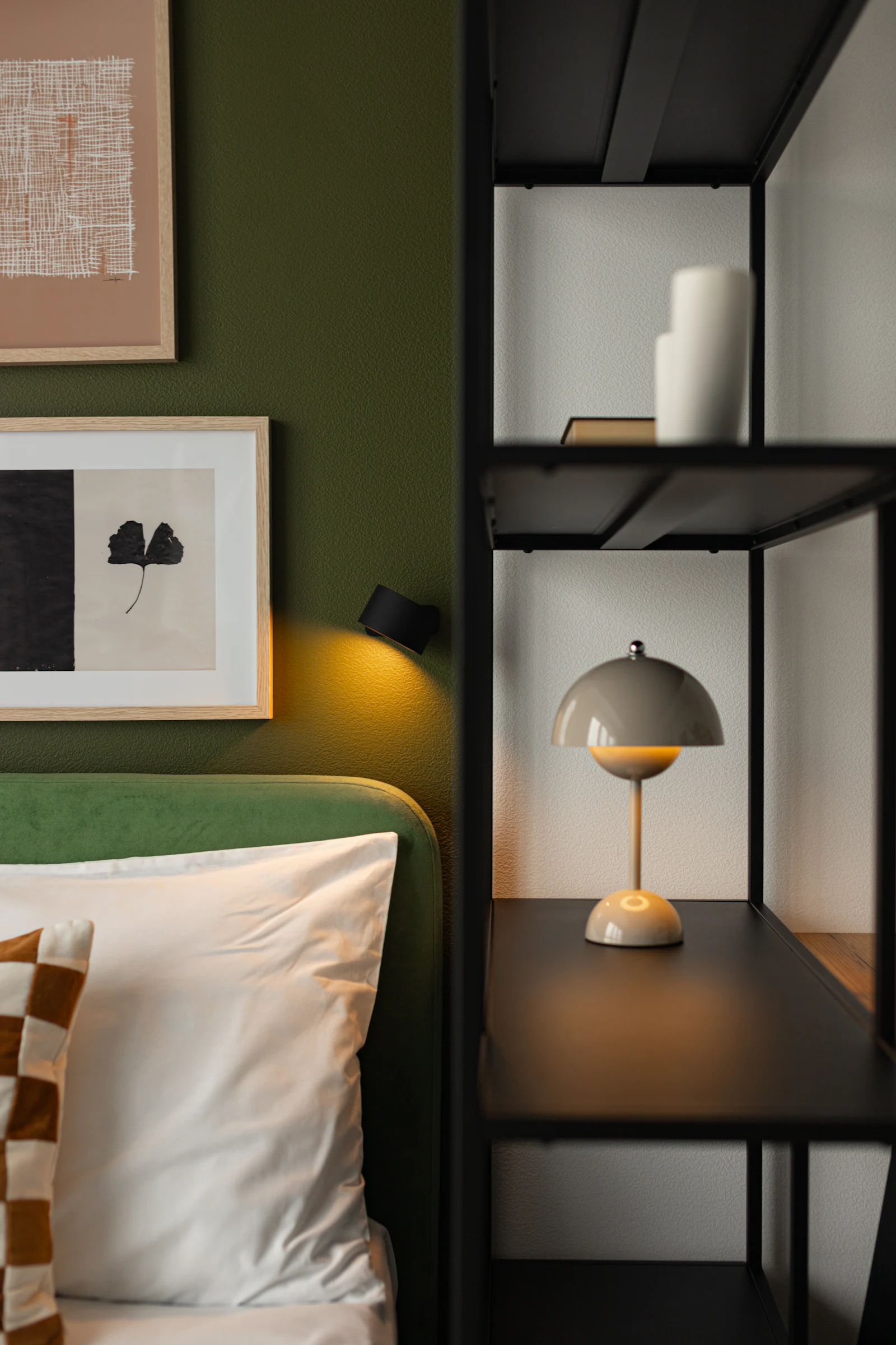
| Secondary | Olive green (#353C30) | A study or bedroom wall, cabinetry, a sofa |
| Accent | Warm brown (#8B6A55) | Wood tones, leather, frames, cushions |
Step 5: Apply the 60-30-10 principle
Once you have a palette, the 60-30-10 principle helps you balance it within each room:
- 60 per cent dominant colour: walls and large areas.
- 30 per cent secondary colour: major furniture, curtains, rugs.
- 10 per cent accent colour: accessories, art, small pieces.
This is a guideline, not a law. A calm bedroom might be closer to 70-25-5, while a lively family room might push the accent further. The value of the rule is that it prevents all colours from competing at the same strength.
Step 6: Plan the flow from room to room
Stand in your hallway or main living space and look at which rooms are visible from there. These connected spaces should feel related. There are several ways to achieve this:
- Use the same base neutral in all connecting spaces and ceilings.
- Paint all trim, skirting boards and doors in one consistent colour.
- Repeat an accent colour in different rooms through textiles or objects.
- Use a deeper shade of the same colour in a smaller room for a gentle shift in mood.
Private rooms, such as bedrooms or a study, offer more freedom for stronger or darker colours because they are experienced on their own.
Step 7: Test before you commit
Never choose paint from a small chip alone. Colours intensify on large surfaces and change with light.
- Buy sample pots or large painted sample sheets.
- Paint samples at least A3 size, ideally on several walls.
- Observe them in the morning, midday, evening and under artificial light.
- Place them next to your flooring, furniture and fabrics.
- Live with them for a few days before deciding.
Designer tip
If you are torn between two shades, choose the slightly softer, more muted one. Colours almost always look stronger on four walls than on a sample.
Palette ideas to inspire you
Warm natural
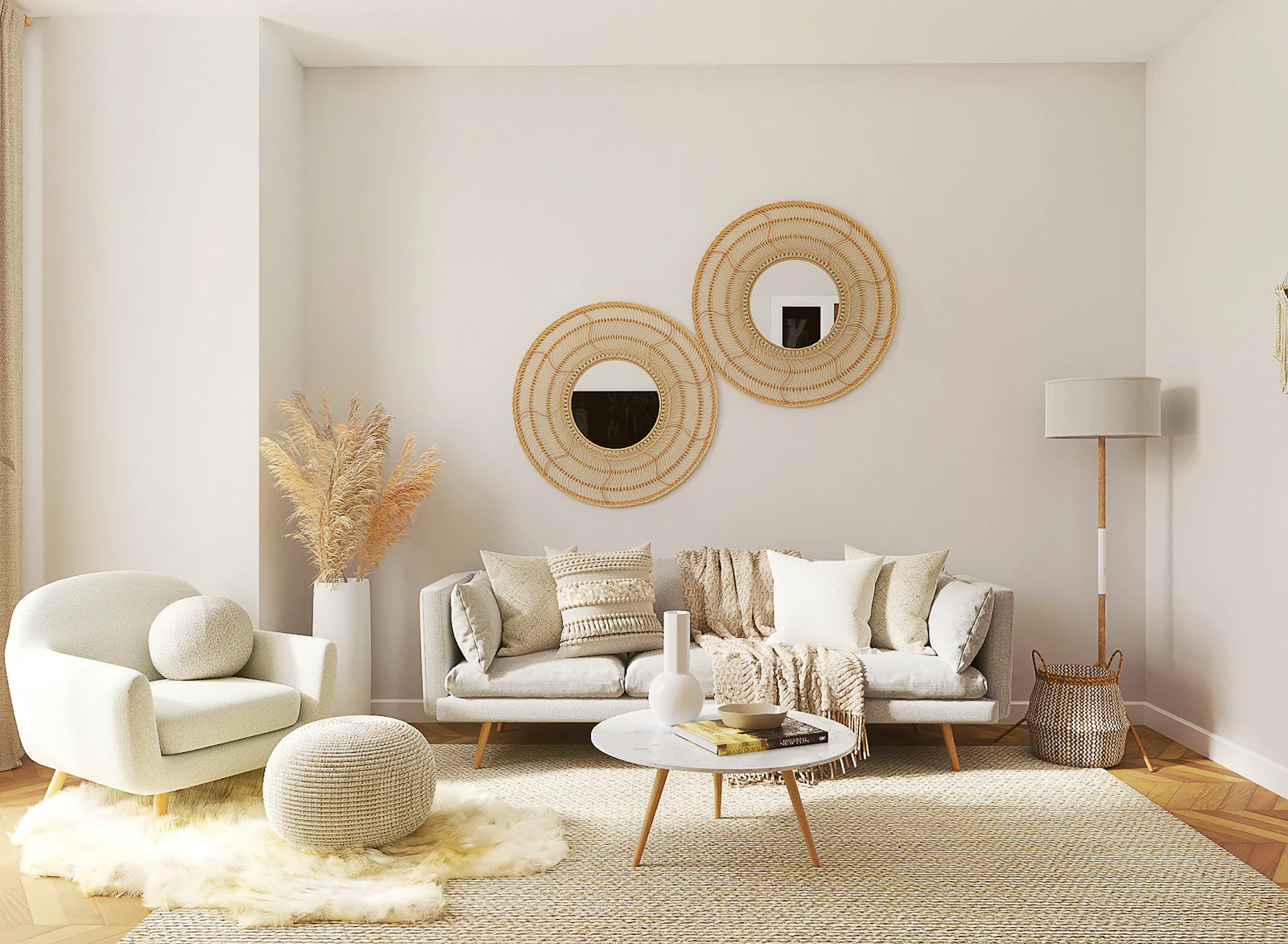
Ivory, sand, oak and olive green. Calm, grounded and timeless, ideal for homes with lots of wood and natural textiles. It pairs beautifully with the ideas in our article on creating a timeless living room.
Soft earth
Warm white, clay, terracotta and cognac. Inviting and sun-washed, with a Mediterranean character.
Quiet coastal
Soft white, pale grey-blue, driftwood and navy. Fresh and airy, perfect for bright rooms.
Deep and moody
Stone, charcoal, forest green and brass. Rich and enveloping, best for rooms used in the evening, such as a study, dining room or snug.
Warm minimal
Ivory, greige, black and natural linen. Clean and sophisticated, with warmth coming from texture. Explore this approach in our guide to warm minimalist decor.
Common colour mistakes
- Choosing paint first: it is easier to match paint to fabrics and furniture than the other way round.
- Ignoring undertones: the most common reason colours “don’t look right” together.
- Pure white everywhere: stark white can feel cold, especially in low light. A softer white is often more flattering.
- Too many accent colours: choose one or two and repeat them.
- Forgetting the ceiling: a slightly tinted ceiling can make a room feel more finished.
Colour beyond paint
A palette is not only about walls. Some of the most successful colour schemes rely on paint for the background and let other materials carry the character. Thinking this way gives you more flexibility and often a richer result.
Textiles
Curtains, rugs, bedding and upholstery are large areas of colour that also add texture. A sand-coloured linen curtain or an olive wool throw can introduce a secondary colour more softly than paint, and it is easy to change with the seasons.
Wood and natural materials
Timber, leather, rattan, stone and terracotta all have their own colours and undertones. Count them as part of your palette. A warm oak floor, for instance, already brings a honey tone that may be enough to warm up a cool wall colour.
Metals and finishes
Brass, bronze and copper read as warm accents, while chrome and steel feel cool. Black metal works as a neutral punctuation mark. Keep metal finishes consistent within a room, or limit yourself to two, so they support the palette rather than compete with it.
Plants and art
Greenery is a living colour that works with almost any scheme, and artwork can introduce the accent colours of a room in a single gesture. Choose art first and pull wall and textile colours from it if you find starting from a blank wall difficult.
Your home, your colours
The perfect palette is the one that makes you feel at home. Start with your fixed elements, study your light, understand undertones, and build a small, balanced set of colours you can repeat throughout your home. Test patiently and trust how each colour makes you feel.
Before you paint, read our guides to paint finishes and choosing a white, and use our paint calculator to buy the right amount. You can also browse our inspiration gallery to see warm, natural palettes in action.
Frequently asked questions
How many colours should a home colour palette have?
Most homes work well with three to five colours: one or two neutral base colours, one or two secondary colours and one accent. You can use different proportions of the same palette in each room to create variety while keeping the home cohesive.
How do I find the undertone of a paint colour?
Compare the sample with pure white paper and with other colours in the same family. Warm neutrals lean yellow, red or pink; cool neutrals lean blue, green or violet. Looking at the darkest shade on the same paint card often reveals the undertone more clearly.
Should every room in my house be the same colour?
Not necessarily. Rooms should relate to each other, especially those visible from one another, but they do not need to match. Use a shared palette and vary the proportions, or keep a consistent colour for hallways and trim to link rooms with different wall colours.
Does the direction a room faces affect colour choice?
Yes. In the northern hemisphere, north-facing rooms receive cooler, indirect light, so warm colours usually work better. South-facing rooms receive warm light most of the day and can take cooler shades. East and west-facing rooms change throughout the day, so test colours in the morning and evening. In the southern hemisphere, the effect of north and south is reversed.
What is the 60-30-10 rule in interior design?
It is a guideline for balancing colour: about 60 per cent of a room in the dominant colour, usually walls and large surfaces; 30 per cent in a secondary colour, such as furniture or curtains; and 10 per cent in an accent colour, such as cushions, art and accessories.
Measurements and rules of thumb in this guide are starting points; always check your own room, local building rules and manufacturer instructions. Images are illustrative, from Unsplash. Read how we research and update our guides in our Editorial Policy, and tell us if you spot an error.